Have you ever seen RSI overbought and wonder whether it was the right time to sell? Let’s face it, an overbought reading in a momentum oscillator can merely mean that price is strong and may even turn into an uptrend.
Is it a valid overbought signal? Do you sell? Where do you sell? Where should you place your stop?
Quite often using two charts of different time frames can help. For instance, let us suggest you have seen an overbought reading in the daily chart but there is no bearish divergence. What you can do is look at a shorter time frame chart, a 4-hour or 2-hour chart to see what is happening there an whether a more accurate sell signal can be identified. Let us look at recent example in EURUSD:

Above is the daily chart of EURUSD as it approached 1.3258. Daily Rapid RSI was showing an overbought reading but there was no bearish divergence. From this chart alone we probably couldn’t work out whether there was a selling opportunity or not.

This second image is the 2-hour chart of EURUSD but here it can be seen that the peak at 1.3258 was accompanied by a bearish divergence in Rapid RSI. We are therefore on warning that a reversal can occur and that the daily overbought reading may well be correct.
Next we have to identify a selling level and in this case it is on the break of the price support line which has touched price four times before it finally breaks and this is where we can place our sell-stop. The money management stop should ideally be placed above the 1.3258 high but if this is too high and would cause a large loss then we can look at placing a stop above the rising trend line. However, do note that is a rising trend line and could mean that your stop needs to be raised to allow a possible retest of the line.
In this case the trade would have been very profitable with a decline down close to the daily pivot support which rests around 1.3050. A take profit order can be placed just above this to exit the position at a tidy profit.Following on from the first description of using multiple time frame charts to both strengthen your analysis and enable tighter entry and exit trades, let us take another look at using these in a different example.
Many traders like to use Bollinger Bands to try and identify entry signals. The problem I have always had with them is that they only provide approximate support and resistance which causes problems in knowing where you should enter and where the stops should be placed. Not only that but sometimes they just don’t seem to work at all as a support/resistance tool and the judgment of when they’ll work appears purely subjective.
Take a look at the daily chart of GBPUSD:

In the center of the chart we can see that price has declined to the Bollinger low and on first touch it does bounce only to fall below the lower band and does so on three consecutive days. On the day before the absolute low Rapid RSI moves into the oversold extreme. Does this mean we can buy? Maybe. Sometimes it works and sometimes it doesn’t.
So what should we do?
The following chart is the 2 hour chart showing the approach to the low at 1.9400.
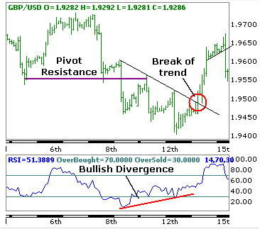
On the left of the chart we can see that price falls below two identical lows and these can then be considered as pivot resistance. We then see the three pushes lower and on the daily chart we know that the Rapid RSI went into an oversold extreme.
Do we buy at that point because is looks like the Rapid RSI on the 2 hour chart is developing a bullish divergence? The answer is “no.” Divergences should only be traded on a break of a pattern. In this case we have an intermediate downtrend line and it is only after the final low that price breaks above the trend line and thus confirms the bullish divergence in Rapid RSI. You will also note that following the break above the trend resistance that price reverses briefly to retest the trend line which provides a second buying opportunity.
Following the break of the trend line which was the day after the daily oversold reading price rallies by 200 points. That’s a good profit… Not only that, by waiting and observing the 2-hour chart you can avoid trying to pick the bottom as suggested in the daily chart.
Remember, it is normally best not to try and pick tops and bottoms as these will often provide losing trades. Waiting patiently for the right signal by fine-tuning the entry on a shorter time frame chart can reduce losing trades and make the final trade a more profitable one.
Good luck !