When is a pattern not a pattern?

A guide to avoid loss making trades

When is a pattern not a pattern?

The easy answer to the question is “when it’s not a pattern”. And that really is the real crux of the issue… Let me explain.

Let’s take a look at one of the most simple patterns in technical analysis, the Double Top (Bottom).

This is the hourly chart of Dollar-Swissie in a run up from the 1.0883 low which found a high at 1.1324. Following this it pulled back lower and then attempted to move back to the high once again. However, it failed just 6 points from that high and then declined quite sharply.

In this process it formed what we call a “Double Top.” This is a classic reversal pattern that through measurements will provide a minimum target in the reversal. Basically, by taking the number of points from the peaks and the intervening corrective low it is then possible to project lower from that trough to generate the minimum target.

In this example the pattern has worked perfectly. What is more, the Rapid RSI below has formed what is a bearish divergence. This is recognized by higher price peaks from the intermediate peak towards the left center of the chart to the eventual 1.1324 high. However, over this period the RSI has not made new highs – but the RSI makes a lower high at the 1.1324 high which represents a slowing in the underlying momentum of the trend.

A combination of this bearish divergence and a subsequent break of a trend support line and failure on the retest of the trend line sets up a stronger reversal which meets the minimum target perfectly.

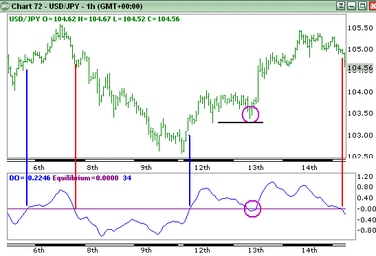
OK, this is simple, let’s look at another example:

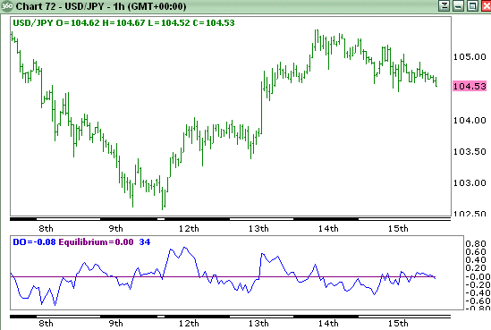
Here we see exactly the same thing happening in the hourly Euro chart. Price has rallied strongly with Rapid RSI forming a high at 1.4751 and then on the pullback lower braches a trend support line. Following the initial decline price rallies back towards the 1.4751 high but fails on the retest of the trend line.

This looks positive. Measuring the points between the twin highs and the intervening trough, from the current price there appears to be 300 points profit.

So if I take a trade of €1mn I can make €30,000 profit and buy a new car…

Well, this is what then happened.

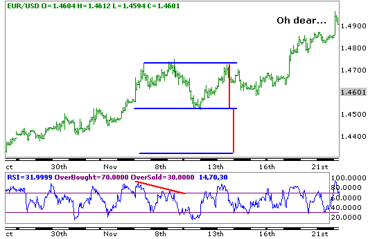
Ah… the Euro actually continued rallying.

So why did the Double Top pattern fail?

As I said, because it wasn’t a double top pattern…

It is vital to understand that a double top only becomes a double top when the intervening trough is breached. (And a double bottom only becomes a double bottom when the intervening peak is breached.)

Clearly this didn’t occur here.

This is very simply explained by examining the definition of an uptrend – which occurs when both highs are moving higher while lows are also moving higher.

If we want to be safe in identifying double tops (or bottoms) we should also satisfy the requirement that the sequence of higher lows is broken – which would be when the intervening trough is breached.

Therefore, avoid this simple error which many still fall into by ensuring that the intervening trough (or peak in a double bottom) is broken to confirm a breakdown of the trend.

Gook luck !

Overbought and Oversold RSI Readings

One classic interpretation of momentum indicators is that of overbought and oversold. Normally these are quite good signals when used within a consolidating market although mere oversold or overbought readings should not be used to buy or sell (respectively) without other forms of analysis and preferably in shorter term time frame charts.

However, these overbought and oversold extremes can be useful within trends also. In this type of interpretation it is vital that only trades in the direction of the trend be taken.

First we should remind ourselves of the definition of a trend.

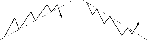
Uptrend: is a sequence of higher highs and higher lows
Frequently, though not always, a trend support line can be drawn across the lows

Downtrend: is a sequence of lower lows and lower highs
Frequently, though not always, a trend resistance line can be drawn across the highs

A good reversal signal at the end of a trend may well be the break back below the support line in an uptrend or above the resistance line in a downtrend. In addition, to confirm the reversal completely a break of the last major swing low in an uptrend or the last swing high in a downtrend will also cause the uptrend to be complete.

The following chart is that of the daily Euro-Dollar chart which clearly has shown a strong and persistent uptrend over the course of both last year and this year. Note how all the major lows remained above the previous low in the move and this was accompanied by higher highs in all cases. Very clearly this can be described as a major uptrend.

Below the chart I have added Rapid RSI. I choose this form of RSI since it is more volatile and reaches overbought and oversold extremes more frequently than the traditional Welles-Wilder formula.
What can we deduce from the chart?

Well, at the left of the chart price was actually seeing a sideways trading range. Both overbought and oversold provided good signals. At these extreme readings, if the 4-hour and hourly charts also showed reversal signals they would have been worth following.

What I do want to point out is that overbought readings of RSI in an uptrend need not necessarily mean that the price is actually overbought. Unless they are accompanied by bearish divergences I tend to look at overbought readings as actually meaning “the market is still bullish.”

This does not always mean that price will continue higher and in most cases there is a pullback, but note how on those occasions that when RSI reached oversold while price has not penetrated the last low point, then it actually provides an excellent buying signal.

You will still need to confirm those oversold signals in the shorter time-frame charts, and it may well be worth combining these signals with the support and resistance supplied by an analytical forecaster. However, very clearly the mere fact that in an uptrend, following a price high that is marked as overbought by RSI, the move to oversold can be an excellent signal to take advantage of the next leg higher.


Now, we have just seen RSI move to overbought at the 1.4966 high. There is one difference however which is that this overbought level has produced a bearish divergence and at a time when price is poised just above a support line that has run from the 1.3359 corrective low. Breach will suggest the trend is complete and take price down towards the 1.40-1.41 area. This should cause a correction as the market remains very bearish Dollars but the technicals are suggesting that a new high in the Euro will not be seen.

The use of (Rapid) RSI in this manner does highlight an alternative method of using overbought and oversold extremes to great effect.

Stochastics Cross Signal

A useful strategy to reduce your losses using stochastics crossover signals

Stochastics are often used to generate buy and sell signals when the %FastD crosses above or below %SlowD. Just how good are these signals?

The stochastic plot here shows where entries are indicated:I have not circled all the signals but just four in the center of the chart that only shows the stochastic plot. The buy signal occurs when %FastD crosses above %SlowD and the sell signal occurs when the opposite is seen – when the %FastD crosses below %SlowD. However there are two other signals in between that provide first a sell signal and then a buy the next bar. This is rather annoying.

Let us seen how the entries might look on a chart.
Clearly, when there is a modestly sustained move the Stochastic crossovers can provide a reasonable profit but all too often in the small, rather tight range consolidations it can give back much too much of hard earned profits.

Is there any way we can try and prevent this give back? I tend to consider the plain signals provided by momentum indicators as too simple and in a way that doesn’t really fully take price development into consideration. Does a reversal of the %FastD through %SlowD constitute a directional reversal? Personally I do not think so.

Then what does represent directional reversals? Well, if you go back to a fundamental premise on what constitutes a trend it can be defined by looking for higher highs and higher lows in an uptrend and vice versa for a downtrend. If we then just trade without looking at the price chart just because %FastD has crossed through %SlowD then we’re really not think about what we’re doing. Quite often price can see a one or two bar reversal but not to the extent that it penetrates the most recent sequence of higher lows (in an uptrend) or lower highs (in a downtrend.)

What we can do is stipulate that we’ll only buy on a Stochastic cross higher if price penetrates the last swing high, or if the Stochastic crossover is lower then on the breach if price penetrates the last swing low:You can see by doing this it does reduce the number of trades dramatically but actually takes out most of the losing trades. The first short sell to the bottom left of the chart will produce a loss – but this is compared to 6 losing trades without the price filter. The long trend is kept intact in the center of the chart as price rallies and is reversed soon after the peak. We then see two sell signals with no buy signals.

The techniques is not foolproof, as any methodology has its weak points at times, but it can be seen that using a price signal along with a momentum signals can dramatically reduce the number of losses you may need to take on using such a strategy.

Powerful chart tool and economic calendar


Forex Calendar

Using Divergences to Identify Market Reversals

Using divergences correctly can help spot key market turns

Many traders and analyst use price-momentum divergence to identify trend reversals. For those of you who are not familiar with this term divergences may be defined as follows:

* Bullish divergence: When price lows are lower in a trend but momentum lows are higher
* Bearish divergence: When price highs are higher in a trend but momentum highs are lower

Basically what this is effectively saying is that momentum, that is the pace of the trend, slows then the underlying momentum indicator will not confirm the new price extremes by making new momentum extremes.
For example, it is easy to see from this chart that there has been a strong uptrend.
Below the price chart is a form of the Relative Strength Index (RSI)

Note how the RSI is showing a bearish divergence. As you can see price highs are still rising but the RSI peaks have begun to fall. This is a feature that often accompanies a stronger reversal in the trend.

Is this a confirmed reversal signal ?

Let’s see what happened next:
In fact the uptrend continued in spite of the divergence.

While this special version of RSI provides better divergence signals it is vital that price also confirms a reversal. This can be done using several methods.

Firstly, by considering the definition of an uptrend:

Price is making higher highs and higher lows.

To confirm price reversal then we should wait for it to decline below the last significant low. In the first chart price had declined very little and therefore the risk of price continuing its uptrend remains.

Secondly, by looking for break of a trend support:

In this case no break of the support line was seen until after the 2.1160 peak. This was also accompanied by a bearish divergence and therefore confirmed the reversal of the trend.

Note that after breach of the trend support how price later moves back to retest the line. This often provides excellent trade opportunities.

It is a common error that traders anticipate a trend reversal merely because there is sign of a divergence. However, this is not a 100% safe strategy. Unless there are other indications to confirm it is safer to wait for confirmation of the reversal.

Good luck

MA and bollinger tighten

Bollinger bands are very useful in determining price direction. You will notice that whenever the bands tighten, price explode out in a direction that is pretty much determined by the attitude of the 200 EMA.

A useful directional oscillator

Have you ever looked for an indicator that could provide you with a broad indication of price direction? Well, here’s a nifty little indicator that could help.

It’s very similar to MACD but tends to suffer fewer whipsaws in flatter corrections. The basic concept behind the MACD indicator is instead of using the crossover signals of two moving averages to base signals, it assigns one (exponential) moving average to represent price and a second, longer (exponential) moving average to represent the underlying direction of price.

The problem with just using the crossovers of two moving averages is that the signals can come very late and much of the directional move can be complete when the signal is finally generated.

The MACD, by measuring the width between the averages, is more sensitive to how fast the averages are moving apart (divergence) and also how quickly they are moving together (convergence.)

The drawback of MACD is that it can be so responsive to changes in direction that it can provide a signal too quickly.

The challenge is therefore to devise an oscillator that will remain responsive but avoids some of the premature signals.

Therefore, what I did was use a linear regression average. While all averages have a lag due to the look back period the linear regression average tends to remove some of the lag and move closer with price itself.

What we could do as an indication is merely take the close price and deduct the value of the linear regression average. However, as you can see from the following image it produces a rather choppy result from which signals are not obvious or even useful.

Raw Directional Oscillator

Therefore the challenge was to provide a signal that was more a reflection of the underlying direction. To achieve this I took an average of the linear regression average but to retain sensitivity I used and exponential moving average that gives more weighting to recent values. I used the same period for the exponential moving average as I did for the linear regression average.

Then to avoid whipsaws from price I used a 10 period linear regression average of price. Now, the result is far more useful…

Smoothed Directional Oscillator

Basically using the crossover of the oscillator through the zero equilibrium line we can generate signals. Very clearly such simple signals are rather raw and we should at least use some basic common sense.

For example, to the middle right of the chart we can see a period of consolidation that caused the oscillator to drop below zero and then recover. When seeing this we should remember that using indicators blindly can make us ignore very simple rules.

We can see that price is consolidating and in these situations it is far wiser to trade on breaks. If price had fallen to break below the first corrective low then it would have been a stronger signal. Until that occurs we can still see that both highs are rising and lows are rising which indicates a potential uptrend.

We may choose to square a long position and then renter once a stronger signal has been generated. If the general trend in a larger time frame (this chart is hourly) we could choose to remain in the position. In this situation it would have paid off.

Good luck !